Recent searches
Search options
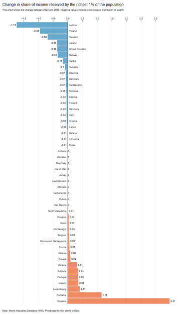
It's Day 9 of the #30DayChartChallenge, and the prompt is "Diverging"
Looking at % point change in wealth inequality between 2022 and 2023 in Europe
Made with D3
(Interactive version is large so text looks a little small in the screenshot!)
Although I'm mainly using Quarto with Observable and D3, I've also been uploading the interactive versions on Observable HQ: https://observablehq.com/@nrennie

@nrennie Income and wealth are not the same. The chart shows the change in income distribution over a one year period by wealth. Useful, but not an indication of wealth inequality. A nation can have very little wealth inequality but will still have a definition of a top 1%.
@HumanMapping Yes, it's based on this data: https://ourworldindata.org/economic-inequality where share of income is used as an economic inequality.


